We launched our new brand in late 2019 with our fabulous refreshed logo and all it stands for, as InnovaLang continues to grow and develop apace. Our values are the same, but our offering keeps expanding!
Breaking out of the circle
Innovating means going against the flow, transcending trends and getting out of your comfort zone. And that’s exactly what we do. We know that slavishly following fads in the mainstream would compromise our principles and distract us from our insistence on total quality.
We entered the translation industry after years of university study, with master’s degrees in languages, majoring in applied linguistics. To be a real translation professional, it is not enough just to be able to speak a couple of languages. You need to master their mechanisms and functions, their variants and how they develop in relation to time, space, the communities who speak them, and the media in which they are expressed.
Linguistics, we note with pride, is the scientific study of human verbal language and its structures, a scientific discipline founded on objective, empirical methods. This knowledge underpins our rigorous approach to the subject and its application in the form of translation. We put it into practice using state-of-the-art tools, continually innovating our methods and processes while keeping people (our clients, suppliers and staff) at the heart of everything we do.
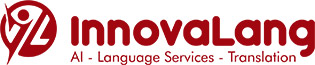
In our refreshed brand, we retain the name but without confining ourselves to the European dimension. We’ve added a new symbol: a stylised form of our “IL” initials where the “I” becomes a person breaking out to explore and innovate, while the “L” remains the cornerstone of our great passion for languages, driving forward into the future.
The garnet colour and the corner of the L represent continuity with our founding values.
The new logo is the creative brainchild of Maioriz, the internationally renowned designer who won the contest we launched on the 99designs platform. This was the brief:
“Our new logo should comprise the name ‘InnovaLang’ and a geometric shape with the letters ‘IL’ inside, to be usable as an icon instead of the full name. Please use our current logo colour, garnet. The ‘IL’ inside the shape could also contain some elements that evoke human value in a world ruled by technology, once again in a highly conceptual and abstract way.”
The specially created Brand Guide is available for download.